Rebuilding Patient Activation Flow
As NYU Langone launched telemedicine, only 15% of were completing the account creation flow. I redesigned the flow with clearer guidance, inclusive language, and proactive error handling—improving completion rates and enabling telemedicine at scale.

Problem
Activation was the first touchpoint—and it was failing. Only ~15% of activation visits created accounts. Patients got stuck at validation and treat the verification email like a receipt.
What we wanted to learn
Research goals
- Pinpoint friction across the activation journey (validation → verification → creation).
- Compare comprehension and effort on mobile vs. desktop.
- Clarify mental model of “activation” and expected next steps.
- Evaluate copy, labels, and rationale for data requests.
- Understand why verification emails are ignored.
Participants (sample)
- 8 current patients (EN/ES)
- Age 20s–40s, mixed devices
- Varied tech literacy
- Across Manhattan, Brooklyn, Queens
Presented here as a compact summary to prioritize readability over a full table on mobile.
User scenarios (study prompts)
You booked an appointment and heard the NYU Langone app helps manage care. Activate your account and sign in on your phone.
After booking online, you notice “Sign up for MyChart.” Create your account and confirm your email to access visit details.
What we learned
Observations
- “Check” icon + “Thank you” subject implied completion before verification.
- No progress indicator; patients felt “blind” to how many steps remained.
- Username/password rules surfaced only after errors → retries.
Insights
- Language mismatch: “create” vs. “activate”.
- Error copy must instruct how to fix, not just flag a problem.
- Prevent errors proactively with rules, hints, and defaults.
Biggest issue is forgetting the password because different validation rules.
I’m confused about create vs activate.
I thought I was done because the email starts with Thank You.
Our plan
Reduce cognitive load and ambiguity by making activation visibly guided, language-clear, and error-preventive.
What we set out to do
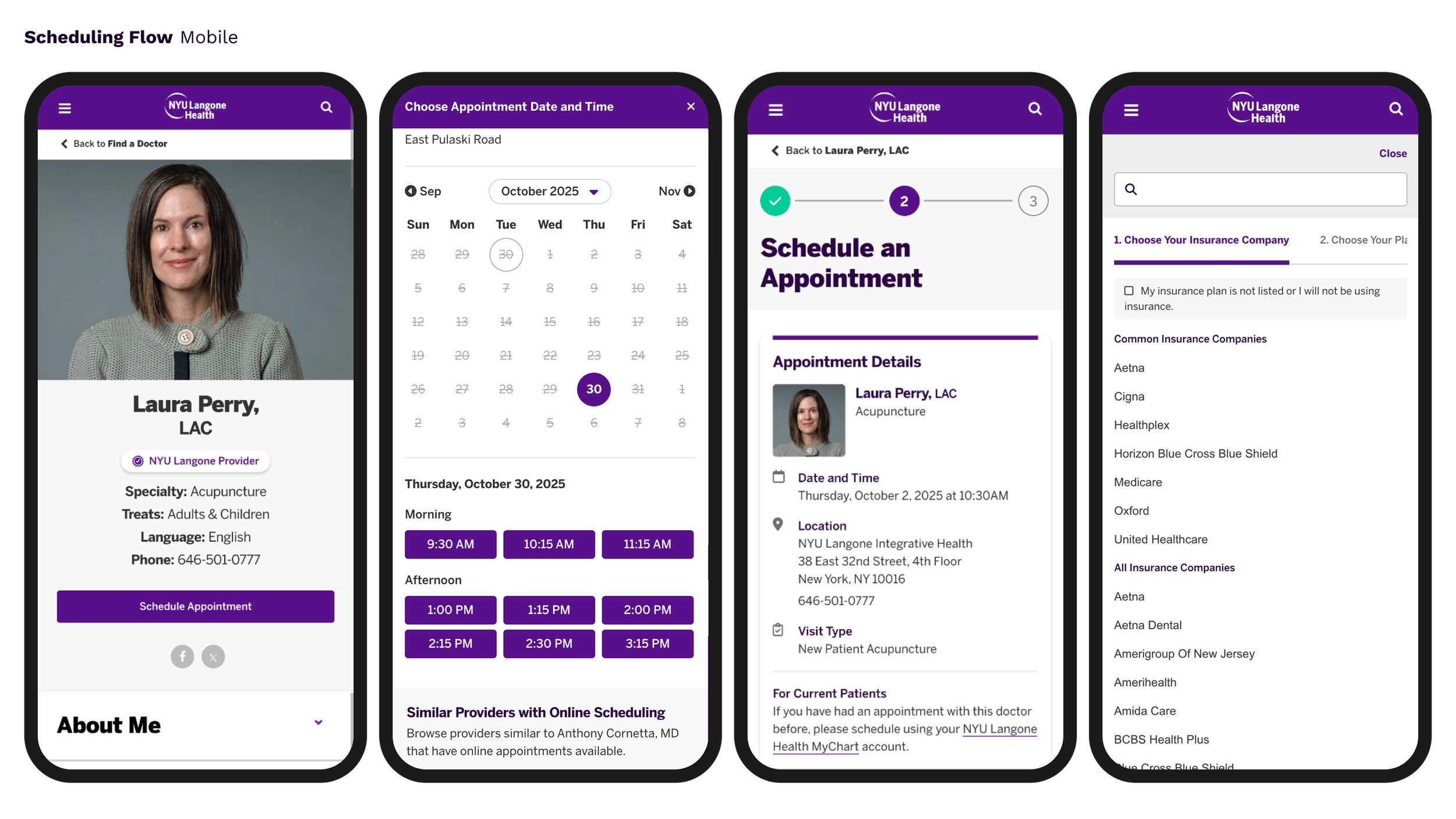
- Introduce a three-step tracker (Find Record → Verify → Activate).
- Rewrite copy for purpose + next step clarity.
- Show credential rules before input; inline validation/hints.
- Revise email: clear subject/CTA (“Confirm your account”).
- Support SMS verification and mobile-first forms.
Why it mattered
- Activation is the entry point to care—trust begins here.
- Telemedicine adoption depends on seamless first-use.
- Lower support burden via self-evident workflows.
Challenges
- Legacy systems: Epic/MyChart logic constraints.
- Complex workflows: Patient record matching, identity verification, security.
- Regulation: Accessibility, privacy, translation parity (EN/ES).
Solutions
Thesis: Reduce cognitive load and ambiguity by making activation visibly guided, language-clear, and error-preventive.

A more guided experience
step tracker, preventing errors with more help text, more instructive language.

More inclusive and accessible communication design
Clearer, more direct and accessible language and icons to help people understand their status, objective and what they need to do.

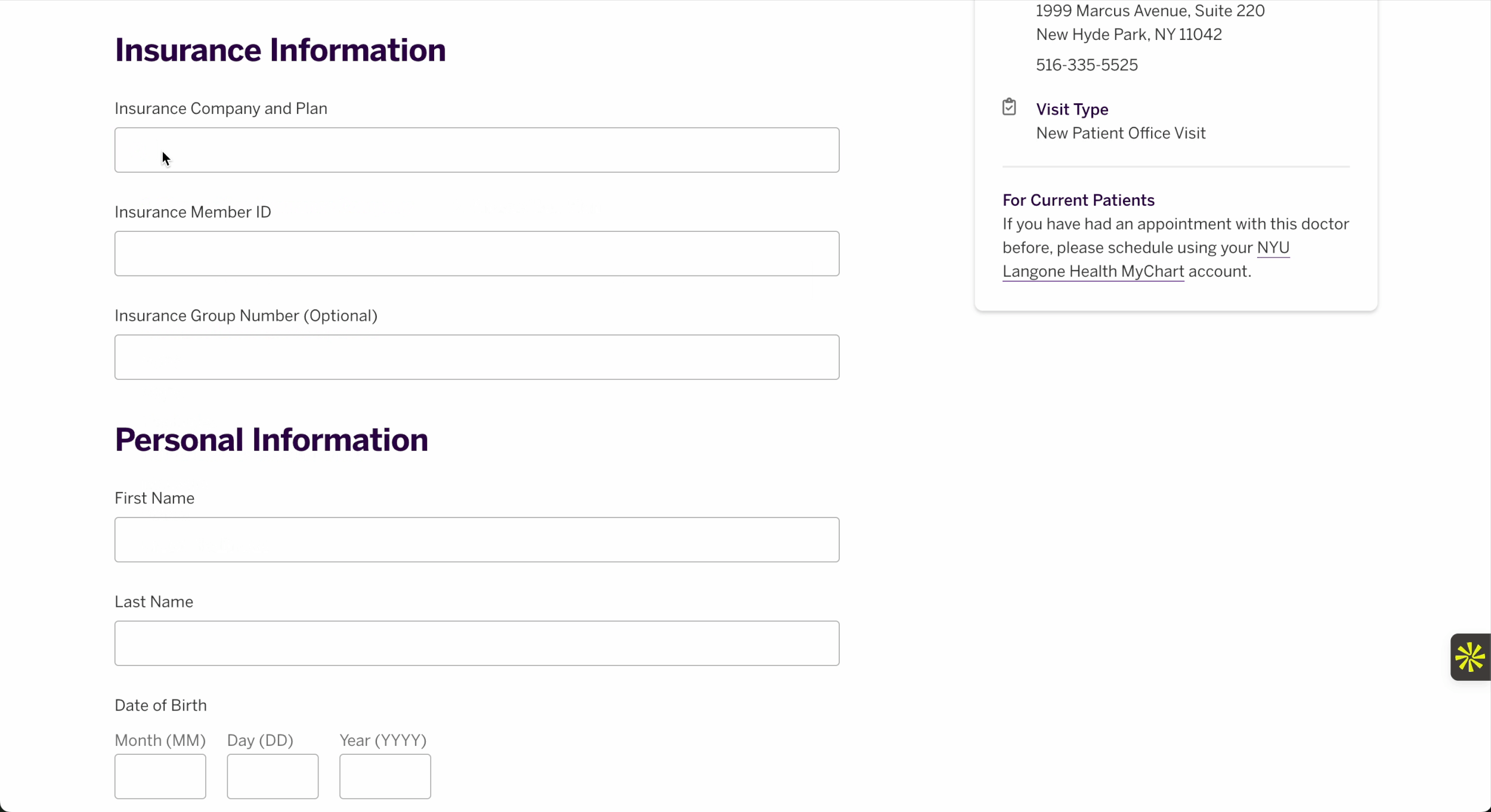
Owned, improved and implemented new form comoponent library and documentation.
Elevated flows across organization by improving forms component librarie, from account creation for myChart to scheduling a doctor's visit.

Led UX Writing Guidelines
Worked across teams to standarize accessible language, clear formatting and a helpful voice.
Key improvements
Guided progress
Three-step tracker and page-top guidance eliminate the “blind” feeling; expectations are explicit.
Proactive prevention
Rules, hints, and inline validation appear before input; copy becomes instruction, not admonition.
Stronger handoff
Email subject/CTA rewritten to emphasize confirm and why it matters; fewer users stranded between systems.
Impact
Reflections
- In regulated workflows, predictability is a usability feature—guidance must be visible and consistent.
- Systemized forms + copy turn one win into many; DS integration multiplies impact.
- Designing around Epic/MyChart constraints meant focusing on language, sequence, and verification clarity.